Structure meets energy: Branding and design for Azzety
"Good design turns a tool into a brand – and a brand into a choice." — 7i7® Design GmbH
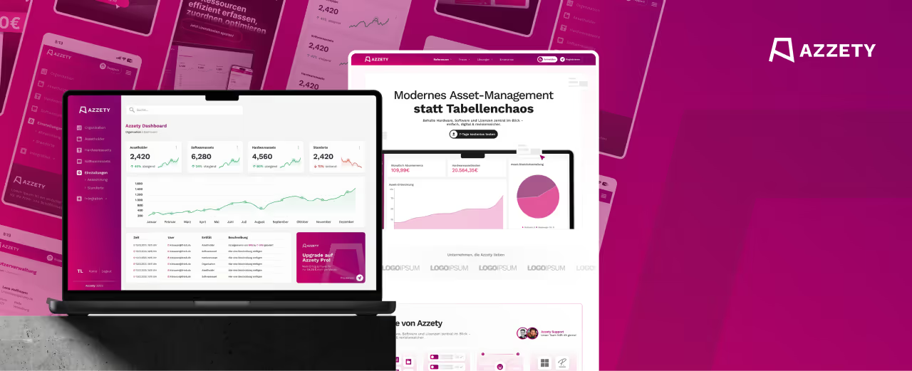
Azzety is an IT asset management platform for SMEs – a tool that centrally manages hardware, software, and licenses to simplify the daily grind. It is a technical solution that needed to look anything but dry and technical. 7i7® handled the logo design, creative assets, and dashboard design, creating a brand that stands out immediately in a sober software market.
Branding with unmistakable energy
Azzety’s visual system breaks with the expectations of IT software. Instead of cool blues or neutral grays, a powerful magenta-pink dominates as the primary brand color, radiating dynamism and confidence. Fluid, curved shapes in the background give the design an organic lightness that makes the platform’s technical capabilities feel accessible.
The logo fits seamlessly into this design language: concise, modern, and with a clear, distinct form that remains effective even at small sizes. Typographically, Azzety uses a bold, sans-serif font—headlines that communicate determination, balanced by clean, uncluttered body text.
Dashboard design that convinces
The dashboard is the daily touchpoint between product and user, and it has been designed with that in mind. Clear data cards, intuitive charts, and a consistent color scheme of pink and white create a user interface that organizes complexity without being overwhelming. Key metrics like hardware asset costs or monthly subscriptions are presented with visual precision—readable, structured, and understandable at a glance.
Conclusion
Azzety has resulted in a brand identity that establishes its own visual signature in the software industry. The interplay of an energetic color palette, a clear design system, and a well-thought-out dashboard design positions Azzety as a modern, confident platform—technically impressive and visually unmistakable.

Start your creative projects today.