Branding at every level: Corporate design for Carento
"Good design doesn't just make quality visible – it makes it tangible." — 7i7® Design GmbH
Carento is a modern mobility company with a clear product portfolio: Rent Manager, Fleet Manager, and Claim Manager – three solutions under one brand umbrella. The challenge was to anchor this structure within a consistent visual system that radiates professionalism and trust at every touchpoint. Throughout our long-standing partnership, 7i7® has been responsible for the design of all corporate communications.
Corporate design that works across every format
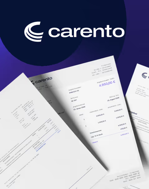
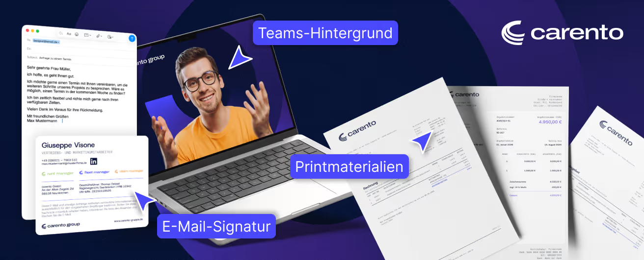
Carento's visual system is based on a deep dark blue, broken up by violet accents and fluid circular shapes – a design principle that suggests depth and movement without sacrificing professionalism. The striking C-logo serves as a recurring design element throughout, giving the brand a visual signature that remains effective even in the smallest details.
This visual language has been consistently applied to all formats: business cards, letterheads, invoice templates, and print materials all follow a unified layout system that clearly structures the three product lines while maintaining a cohesive brand identity.
Digital touchpoints with brand presence
The brand experience extends into everyday digital communication as well. Email signatures integrate all relevant information – including the three product brands – into a clean, professional layout that is instantly recognizable in any inbox. The Microsoft Teams background brings the brand aesthetic into the digital meeting space, ensuring that Carento maintains a professional appearance even on video calls.
Conclusion
Our long-standing partnership with Carento has resulted in a corporate design system that thinks far beyond individual formats. The consistent application of the brand language across print, digital, and everyday communication creates a presence that builds trust on every channel – calm, clear, and unmistakable.
Start your creative projects today.