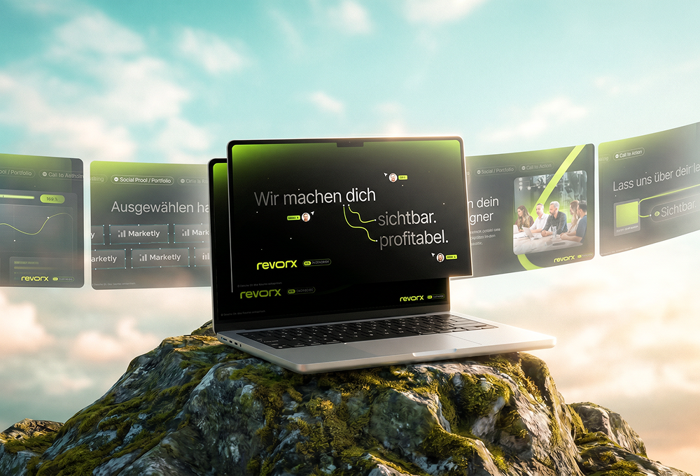
Modern fitness design in orange, anthracite, and white for gyms.
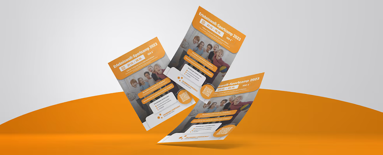
Erlebniswelt Sport is redefining fitness, presenting itself as a holistic concept for modern well-being. As the operator of several gyms, the brand aims not only to motivate people to be physically active but also to create a visual experience. The primary colors—orange, anthracite, and white—play a key role in highlighting this modern approach and the focus on well-being.
Variety
The design portfolio for Erlebniswelt Sport includes a wide range of print products, creatives, and marketing materials. These elements are more than just functional tools; they are an expression of the brand itself. The primary colors are not merely aesthetic choices, but targeted signals to members and potential customers.
Colors
The use of orange symbolizes energy and vitality while conveying a positive attitude toward training. The dynamism of this color motivates and creates an inspiring environment. Anthracite, on the other hand, adds a touch of sophisticated elegance. This dark shade radiates stability and modernity, underscoring the high-quality atmosphere of the gyms. White, as the third primary color, rounds off the design, symbolizing purity and clarity to create an optimal environment for physical activity.
Print products
The print products for Erlebniswelt Sport are more than just informational materials. They are design expressions of a lifestyle focused on health and well-being. Brochures, flyers, and posters become ambassadors for the experience that awaits members at the gym. The coherent design ensures that the brand is present in every communication and maintains a consistent appearance.
Creatives
Creatives and marketing materials serve as the visual face of Erlebniswelt Sport to the outside world. Whether it’s social media graphics, advertisements, or banners, they all convey the brand’s dynamic, modern, and inviting image. The targeted use of the primary colors in these creations strengthens brand recognition and builds an emotional connection with members.
Erlebniswelt Sport uses the interplay of orange, anthracite, and white not just as a color palette, but as a strategic design element. These colors are not only visually appealing but also support the brand's values and goals. They transform the gyms into more than just places to train—they become true "experience worlds" that embody health, dynamism, and modernity.
Designer: Henrik
Start your creative projects today.