Premium restaurant vouchers, exquisitely designed in orange and wine red.
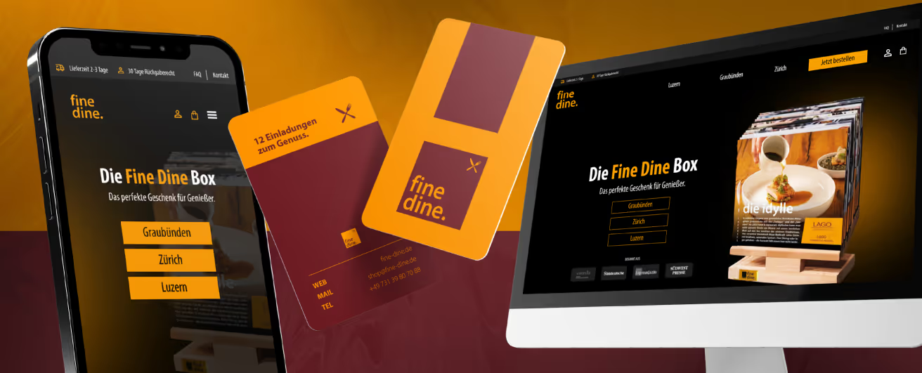
Based in Ulm, Fine Dine is redefining the dining experience by offering high-end restaurant vouchers. With a color palette of warm orange and deep wine red, the brand embodies elegance and style.
Statement
At the heart of Fine Dine are vouchers that do more than just provide access to exquisite culinary experiences—they make a statement about sophisticated taste. The warm colors reflect the sensory appeal of fine dining while radiating an inviting atmosphere. The design appeals to a modern clientele that values quality and stylish experiences.
Concept
Fine Dine vouchers are more than just a payment method; they are an expression of refinement and elegance. The company carefully selects partner restaurants that meet the highest culinary standards. The combination of culinary excellence and Fine Dine’s visual identity creates a synergy that exceeds the expectations of a discerning clientele.
Colors
The orange and wine red color palette was chosen with intent. Orange symbolizes enthusiasm and zest for life, while also conveying warmth and hospitality. Wine red, on the other hand, represents elegance, passion, and a touch of luxury. These colors do more than just provide visual impact; they ensure the Fine Dine experience is perceived as something special from the very first moment.
Conclusion
The modernity that Fine Dine embodies goes beyond design. The platform and service are tailored to the needs of a modern clientele that values flexibility and convenience. By focusing on digital processes, purchasing and redeeming vouchers becomes an effortless experience.
Fine Dine not only bridges the gap between indulgence and design but also sets a new standard for premium voucher offerings in the culinary sector. The combination of aesthetic appeal and top-tier restaurant partners makes Fine Dine the first choice for those who want more than just a meal—they want a unique culinary experience.
Designer: Elias






Start your creative projects today.