Energy reimagined: Website redesign for Galvanek Energy Systems
"Good design makes the complex tangible – and turns technology into trust." — 7i7® Design GmbH
Galvanek Energy Systems stands for modern photovoltaic and heat pump solutions that provide households with true independence from rising energy costs. The goal was clear, and the digital presence needed to be as well. In a long-standing partnership, 7i7® took on the complete redesign of the website: a presence that combines technical expertise with visual impact.
Website redesign with a clear logic of impact
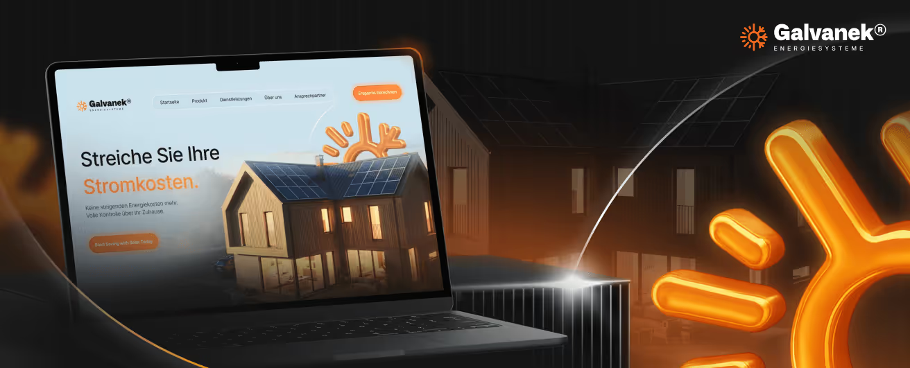
The new Galvanek website follows a well-thought-out UX structure that guides visitors from the very first second. A bright, powerful base design forms the framework, punctuated by vibrant orange that acts as a visual pulse throughout the entire site. This color palette is no coincidence: it conveys energy, dynamism, and determination – qualities that directly reinforce the brand.
The hero section hits the mark immediately. A strong headline, a clear call-to-action, and an atmospherically staged visualization of a home with solar panels communicate the brand's promise directly. The 3D-rendered logo element in the background adds technical depth, signaling professionalism without being intrusive.
Structure that convinces
The page layout follows a consistent sales logic: understandable cost comparisons, data-driven arguments, and genuine customer testimonials interlock seamlessly. Sections such as energy cost calculators, product overviews, and FAQ areas are positioned to build trust before the user even takes action.
Typographically, the design uses clean, sans-serif fonts in varying weights – headlines that guide and body text that informs without overwhelming. The interplay of dark areas, orange highlights, and precise white space creates a digital environment that radiates both technical credibility and accessibility.
Conclusion
The redesign of the Galvanek website has created a digital presence that translates the complexity of an energy systems provider into clear, compelling communication. The combination of a bright aesthetic, energetic color usage, and structured user guidance positions the brand precisely, reliably, and effectively in the digital space.

Start your creative projects today.