Complexity, clearly designed: Whitepaper design for pacemaker.ai
"Good design turns information into conviction." — 7i7® Design GmbH
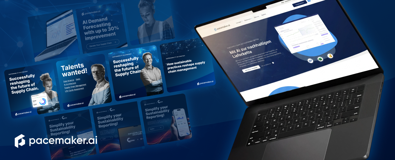
pacemaker.ai develops AI-powered solutions for sustainable and efficient supply chains – from precise forecasting to carbon accounting. It is a subject with great technical depth that requires complex content to be communicated clearly. 7i7® designed the brand's whitepapers – publications that translate complex issues surrounding sustainability, EU taxonomy, and supply chain optimization into a clear, modern layout.
Whitepapers that carry technical content
The strength of the whitepapers lies in their visual composure. A clear layout system with generous white space, precise typography, and a restrained blue color palette creates readability that makes demanding content accessible. Topics such as the EU taxonomy or the Corporate Sustainability Reporting Directive are visually prepared so that structure and argumentation can be grasped at a glance.
Charts, data visualizations, and targeted imagery structure the content and guide the reader through complex relationships – without overwhelming them. The result is a set of documents that do not just claim technical authority, but make it tangible through their design.
Consistency that fits the brand
The whitepaper design fits seamlessly into the digital brand world of pacemaker.ai. The clear, tech-savvy design language – modern shades of blue, clean structures, and a professional tone – ensures that print and digital are perceived as a cohesive brand experience. Whether on screen or in a printed document, pacemaker.ai always presents itself with confidence.
Conclusion
The whitepapers for pacemaker.ai are publications that translate demanding technical content into a modern, clear design concept. The interplay of structured layout, precise typography, and thoughtful data visualization positions the brand as a competent, contemporary partner in the field of sustainable supply chains – dynamic, modern, and convincing.
Start your creative projects today.