Recruiting reimagined: Structured design with a rocket start
“Good design brings clarity – and clarity builds trust.”
– 7i7® Design GmbH
Brand identity with impact
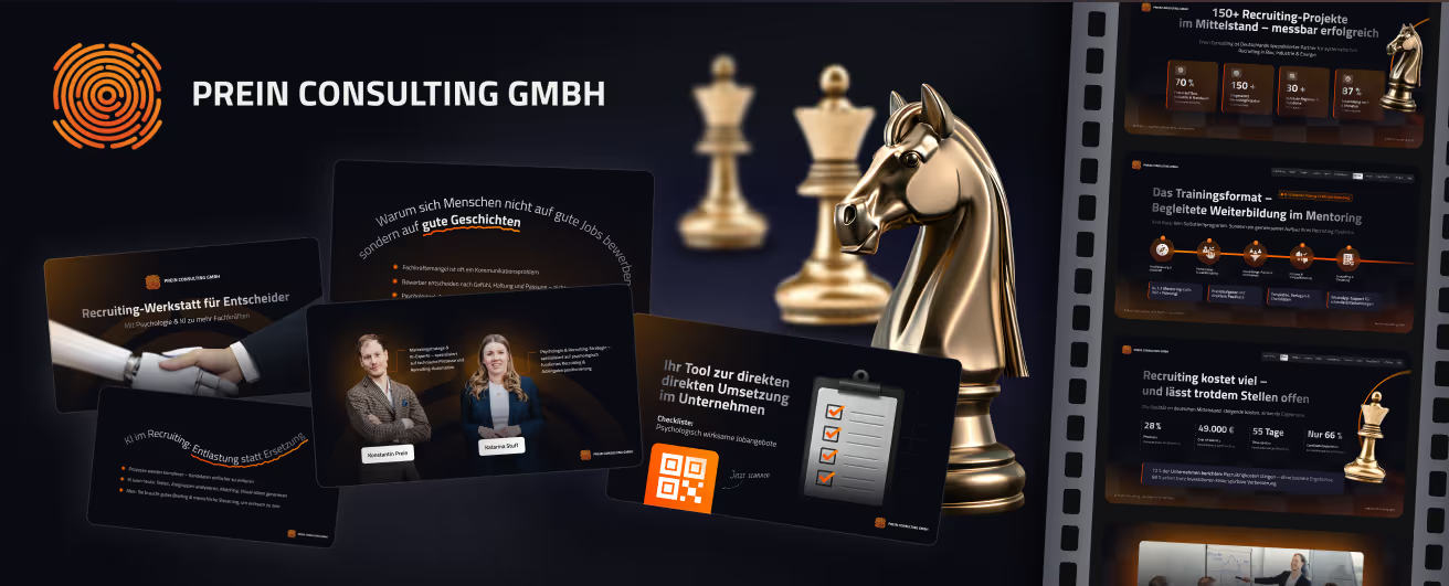
For Prein Consulting GmbH, we developed a comprehensive brand and design concept that conveys a clear message: recruiting can be smart, fast, and strategic. The new logo symbolizes a precise focus on talent acquisition. The color palette of bold orange, deep violet, and calm black gives the brand high recognition value with a striking, professional appeal.
Digital presence: Structure meets dynamics
The new website is the heart of the digital rebranding. It combines clear structures with playful details. The content is modular, logically organized, and conversion-oriented – featuring strategic CTAs, trust elements, and consistent storytelling throughout the user journey. The design bridges the gap between professionalism and a tech-forward spirit – ideal for a consultancy at the intersection of HR, AI, and process optimization.
Presentations & workshops: Content that makes an impact
For the “Prein Strategy Workshop” and other touchpoints like presentations and pitch decks, we developed visual templates that structure content clearly while engaging the audience. Colorful icons, bold graphics, and the targeted use of hierarchy and animation support visual communication without overwhelming the viewer. The design helps present complex recruiting topics in a way that is both understandable and persuasive.
Social media & content creatives: Attention through structure
We also designed custom creatives for LinkedIn and YouTube – from the “Recruiting Hack of the Day” to the YouTube channel design. The visual content consistently incorporates the brand’s colors and design elements, combining information with emotion to ensure recognition in the digital space. Call-to-actions, storytelling hooks, and icons form a cohesive content architecture for maximum visibility.
Conclusion: Design that gets to the point
The new brand identity for Prein Consulting is more than just an aesthetic upgrade – it is a visual strategy. The design builds trust, clarity, and recognition. It supports their positioning as an innovative recruiting partner and provides a platform that enables both growth and impact.
Start your creative projects today.