Segeberger Beer: Tradition reimagined – design with a sense of home
"Design is more than aesthetics – it tells stories, connects people, and creates identity." – 7i7® Design GmbH
Home in a glass – a design that connects
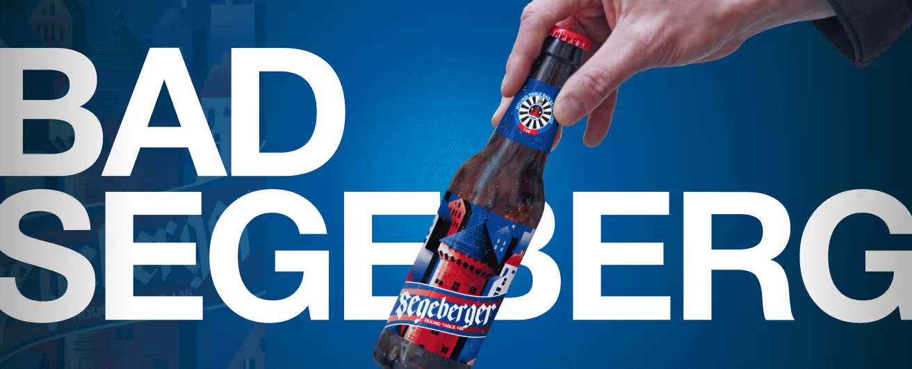
For a regional beer from Bad Segeberg, we created a design that balances tradition and modernity. The label design captures the local identity and gives the beer a distinctive visual presence. With a clear color palette of blue, white, and red, the design reflects regional ties and focuses on timeless elegance.
The water tower as the centerpiece
The central motif of the label is the striking Segeberger water tower – a landmark of the region and a symbol of local pride. Its architectural presence is highlighted in lovingly illustrated details, making the beer not just a beverage, but a piece of local history in liquid form.
Typography with character
The "Segeberger" lettering defines the label in a classic blackletter font. Arranged vertically, it sweeps elegantly across a flag-like shape, giving the design a unique dynamic. The choice of this traditional typeface emphasizes the long brewing tradition, while the modern layout ensures a contemporary look.
A slogan that speaks
"Home in a glass" – this motto captures the essence of the design in four words. It not only conveys the beer's regional roots but also creates an emotional connection with consumers. Every detail of the design underscores this concept and brings the story of Bad Segeberg to life.
Conclusion: A design with heart and history
The new look for Segeberger beer is a tribute to its origins. With a combination of strong symbols, thoughtful typography, and an expressive color palette, the design perfectly unites tradition and modernity. This turns every bottle into not just a moment of enjoyment, but a visual journey home.
Start your creative projects today.